


When it comes time to build the perfect executive dashboard, itŌĆÖs tough to jump right in without really knowing what youŌĆÖre looking at. No matter how tech-savvy you consider yourself to be, dashboards can be tricky without the basics under your belt.
Before diving into the nitty gritty of building your dashboard, you may want to take a look at Part I of this series, to help you get started.
Here are some tips and tricks that you should find useful, especially if youŌĆÖre not yet a seasoned report builder.
Please note: Some of the descriptions below relate specifically to Salesforce-based solutions like Propel, but when it comes to building dashboards, many skills and best practices are transferable.
Reports vs. Dashboards: Though sometimes confused, keep in mind a dashboard is typically made up of reports. So you need to create individual reports before you can start putting them together to create a dashboard. When it comes to Salesforce and Propel, reports are also sometimes called ŌĆ£ComponentsŌĆØ in the context of a dashboard.
Reports vs. Search: Reports and searching can both help give you greater visibility into product information, but each is better at certain things. Search is good for finding something specific, like ŌĆ£Find All Items that Start with ŌĆś100.ŌĆÖŌĆØ┬Ā
Reports can do that, too, but theyŌĆÖre better for identifying trends or aggregating information over a period of time, like ŌĆ£Find me the average time from customer complaint to resolution for the Acme product line.ŌĆØ Experiment to find out which is better for your different use cases.
Pre-Defined Reports: if youŌĆÖre lucky, your enterprise application like Propel will come with a LOT of reports right out of the box, and it can be overwhelming to know where to start. Breathe through that initial panic, and take your time looking at a number of them. Flag anything that seems useful for your business needs.
The fastest way to create a report is to select an existing report type and then see if it can serve as the basis for the report you want. Remember to use ŌĆ£Save AsŌĆØ instead of just ŌĆ£Save,ŌĆØ in case you want to go back to what the report originally looked like.

ŌĆŹAdding Fields: With Propel and Salesforce, itŌĆÖs really easy to experiment and create the report you want. The best way to determine if a default report does what youŌĆÖre hoping it will do is to just create it and start adding fields/columns to the report. ThatŌĆÖs a huge difference compared to traditional reporting tools! And if it turns out the report doesnŌĆÖt include the field you want, then it may not be the right report to use. Once you get the fields all set up, you can easily reorder them.┬Ā
As youŌĆÖre building your report, Propel also has an automatic update feature so your reports show you the latest information as youŌĆÖre adding columns or reordering things. ItŌĆÖs a small yet mighty toggle called ŌĆ£Update Preview Automatically.ŌĆØ┬Ā
Grouping and Charts: A neat feature of the Salesforce platform is the ability to add charts to your reportŌĆösuch as a pie chart, donut, or bar graph. To do this, you would need to group one of your fields, such as ŌĆ£Supplier,ŌĆØ ŌĆ£product line,ŌĆØ or ŌĆ£change type.ŌĆØ After creating this grouping, youŌĆÖll be able to select different chart types with which to view the data.
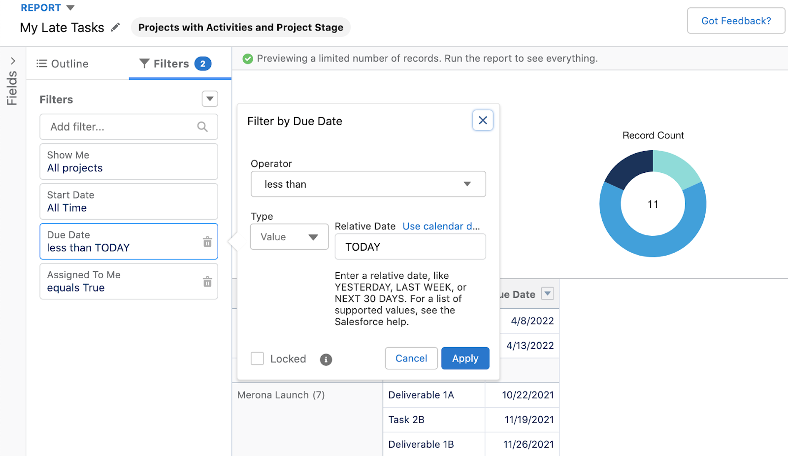
Filters and Relative Dates: Filters are an easy way to screen out (or include) the data you want to see. You can create a filter to include Items that start with ŌĆ£100,ŌĆØ for instance.┬Ā
Using Salesforce as an example, one of the most powerful filters their reporting platform offers is ŌĆ£Relative Dates.ŌĆØ You can use phrases like THIS YEAR, LAST 30 DAYS, etc. to really hone in on what you want to see.
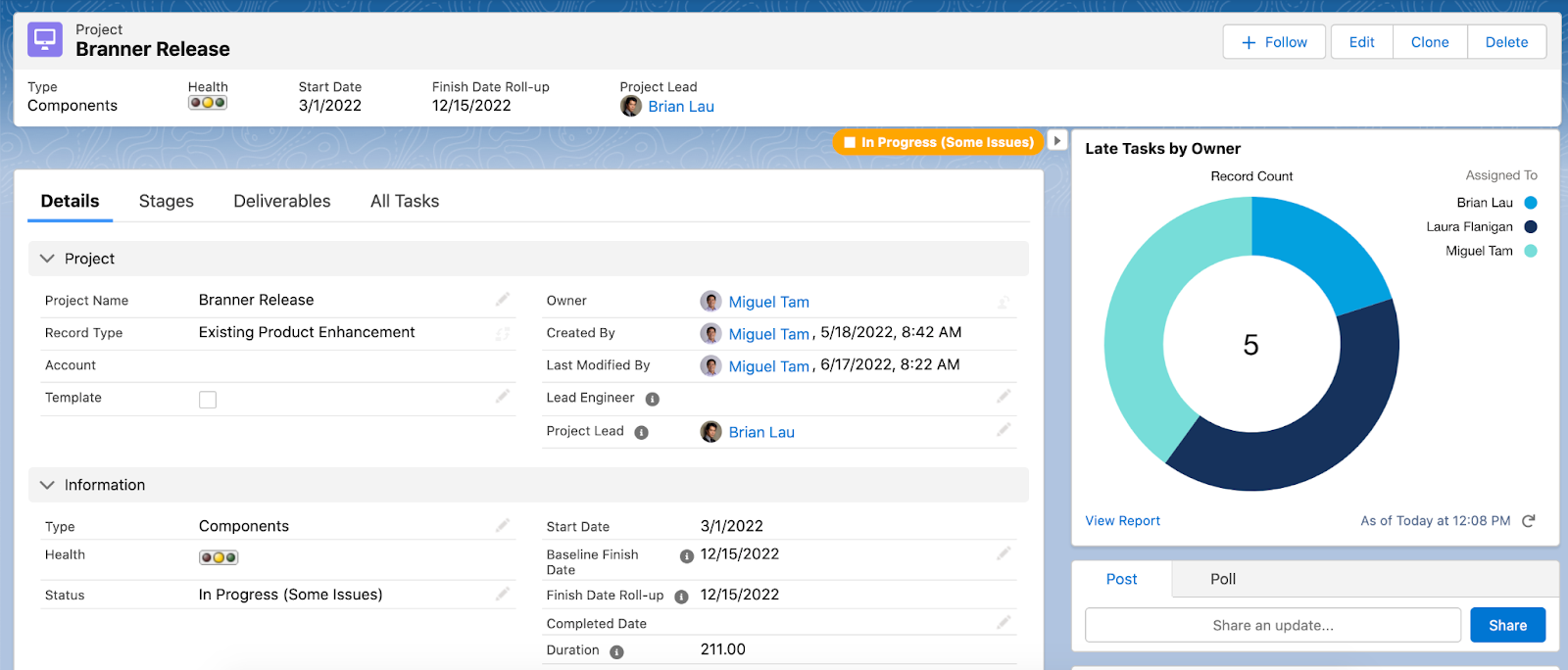
ŌĆŹReports and Lightning Web Components (LWC): One of the best things about having your user interface built with Lightning Web Components is the ability to embed a report on any page that you want. For example, you can create a report called ŌĆ£Late Tasks by OwnerŌĆØ and then embed that on your homepage or a specific Project page, so your team members can easily see whatŌĆÖs past due and needs to be top of mind. (Note that in the Salesforce platform, your report needs to have a chart in order to include it on an LWC page.)
ŌĆŹDashboard settings: With many enterprise platforms, there are a number of ways to fine-tune a Report/Component that youŌĆÖre using in your dashboard. For instance, you can add more filters, and if you edit a specific predefined report, you can tweak what you see from the default report youŌĆÖve already createdŌĆösuch as adding additional columns, changing chart types, or renaming the title.┬Ā
A powerful dashboard type in Salesforce is ŌĆ£Dynamic Dashboards,ŌĆØ which automatically filters data by the viewing userŌĆÖs access levels.

Keep some of the basics in mind as you embark upon your executive dashboard-building adventure. If you have any other essential tips and tricks for setting up reports or dashboards, let us know!
Interested in other features of the Salesforce platform? Read about their user interface framework Lightning Web Components or their commercialization tool Manufacturing Cloud.


.png)

